Introduction: The Beauty of Cinematic Storytelling and Set Design
As a Colour Consultant, I have always been drawn to the world of television and visual storytelling, where every frame is a carefully crafted composition of colour, light, and balance. Set design, costume choices, and cinematography all work together to evoke emotions and tell a story visually before a single word is spoken.
Among the many genres I find inspiring, Chinese period dramas stand out for their exquisite use of colour, meticulous attention to historical accuracy, and breathtaking set designs. The TV series The Princess Royal is no exception, offering a feast for the eyes through its controlled colour palettes, harmonious compositions, and rich visual storytelling.
In this blog post, I will break down my analysis into three colour groups from the series, exploring how the contrast, balance, and movement of cinematic colour within each scene can inspire both interior spaces and emotional atmospheres.
The Harmony of Gold and Turquoise
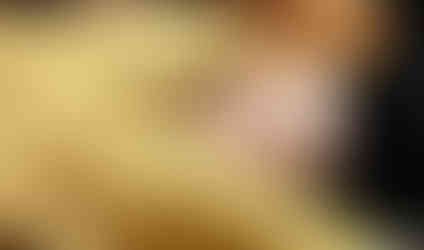


This set of scenes presents a world of warm golds and tranquil turquoise, a pairing that immediately suggests both luxury and serenity. The golden tones wrap the characters in a cocoon-like warmth, creating an intimate and restful mood. Meanwhile, the turquoise hues, seen in clothing and architecture, provide a grounding coolness that balances the richness of gold.
Flesh tone is an essential element in the overall composition. It brings a conversation around the use of white—many people love white ceilings and skirting boards, but these elements can sometimes disrupt a carefully curated colour palette. When thoughtfully integrated, white can serve as a highlight rather than a disruption, working with the surrounding colours rather than against them. Looking at the full composition of an image helps us understand how every shade, including natural skin tones, contributes to harmony.
The warmth of gold can be translated into interiors through mustard-toned textiles, deep ochre walls, and soft candlelit spaces. The turquoise accents remind us that bold contrast doesn’t always need to be jarring—it can be a measured counterpoint, such as teal cabinetry in a golden-toned kitchen or a striking blue accent wall in an earthy living space.
The Power and Poise of Red


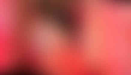


Red is the heart of this group—bold, unapologetic, and commanding. In Chinese culture, red symbolises luck, power, and passion, but in these frames, it is also used with precision and restraint. The key to its success lies in the balance: gold embellishments, deep navy robes, and hints of green act as stabilisers, preventing the red from overwhelming the viewer.
One striking moment features a composition that could inspire an entire room—the blush tones of the face, carefully crafted by the makeup artist as a work of art, could be reflected in soft wall colours, balanced by red and pink tones with subtle yellows, reminiscent of a sunset.
This layering creates an atmosphere that feels both bold and delicate, with depth and warmth unfolding across the space. The pink and blush tones play an important role in working with the intensity of red, ensuring that the space remains inviting rather than overwhelming.
The integration of muted peach tones, rich crimson, and gold accents in interiors can create an atmosphere that is luxurious yet soothing.
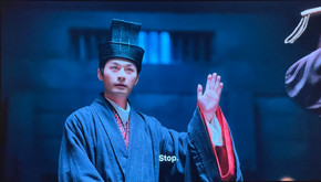
The Minimalism and Stillness of Blue


In contrast to the boldness of red, this palette is about subtlety, restraint, and quiet elegance. Blue is used here not as an overpowering force but as a guide to movement, stillness, and space.
The details on the umbrella in one of the scenes capture this essence—delicate patterns in a small area that are subtle yet powerful enough to stand out. This speaks to how intricate patterns, even in the tiniest details, can transform an entire composition, much like the way a thoughtfully chosen fabric or accessory can elevate an interior.
Another striking element is the turquoise hue of the umbrella, a controlled moment of colour that brings focus and depth to an otherwise muted palette. This is a reminder that a single burst of colour, used with intention, can shift the entire mood of a space. Whether through ceramic details, fabric choices, or soft accent tones, a whisper of colour can be just as impactful as a bold statement.
Finally, the deep navy blue in the last frame conveys minimalism without feeling empty. The balance between darkness and light creates a structured, grounded feeling, demonstrating how bold, dark shades can add depth without overwhelming a space. Whether in a corridor lined with lanterns or a living room wrapped in deep blue walls, the effect is expansive yet intimate.
Summary: Cinematic Colour as an Emotional Language
What The Princess Royal does so well is not just the use of beautiful colours, but the way they are applied intentionally and proportionally. Each palette tells a different emotional story:
Gold and Turquoise - Warmth, tradition, and balance
Red and Gold - Power, drama, and intensity
Minimalist Blue - Stillness, reflection, and space
In design—whether for TV sets or real homes—understanding how colours interact is just as important as selecting the colours themselves. Proportion, contrast, and layering determine how a space feels and functions.
Inspiration is everywhere, not just in films or TV series but in the world around us. Whether it’s a moment in a historical drama, the hues of a sunset, or the composition of an old painting, colour choices are deeply tied to the emotions and experiences we seek to create. It’s not just about the colours themselves but about the feelings and atmospheres they evoke, shaping the spaces we inhabit and the stories we tell within them.
By Robert Paul